Landing pages are prime opportunities to convert your website visitors into leads.
To increase your conversion rate, the landing page design needs to provide a smooth user experience.
Coming up with landing page ideas that will help convert visitors into customers might seem easy enough, but it can be a lot more difficult than it sounds. After all, even seemingly minute details can have a major impact on your conversion rates. Small changes often mean small results. If you want to land the big fish, you’ve got to radically rethink your landing pages.
6 landing page elements to try
Ready to change things up and increase your conversion rates? Use these landing page ideas for inspiration.
1. Use a One-Click Sign-Up Process
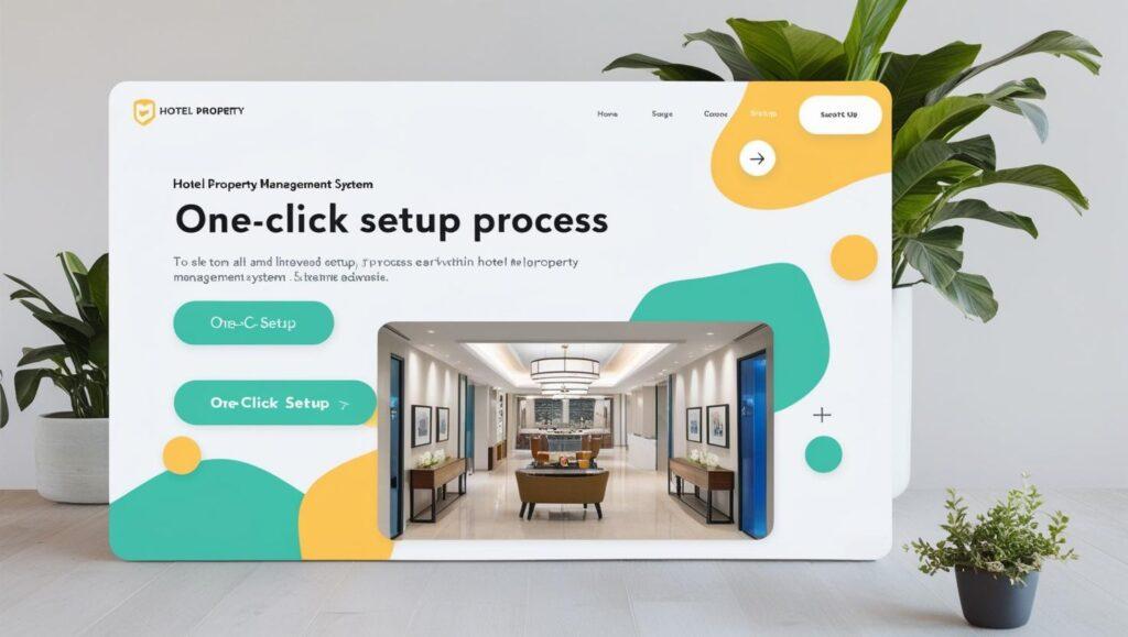
One of the best ways to increase your conversion rates is to make it as easy as possible for your visitors. The more things you ask them to do, the less likely they are to go the distance. Therefore, having a one-click sign-up process becomes extremely important.
2. Use a Catchy Headline
The headline should grab the reader’s attention. It should tell the reader what the product or service is all about. The headline should be short. Never make it more than 20 words, and preferably limit it to 10.
It’s also worth noting that if your headline complements an image that explains the product or service, then you don’t need to go into quite as much detail in the copy.
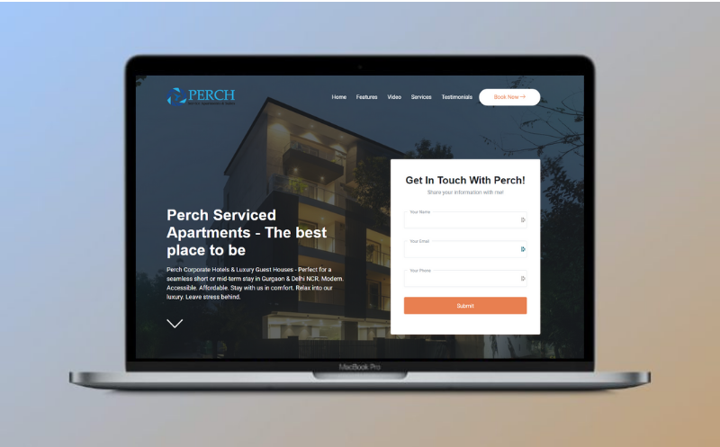
For example below page about a vacation rental system.
3. Pictures
Visual content is an essential component of landing pages that work.
In fact, the brain processes image 60,000 times faster than text. This means that visitors will be affected by the images on your landing page immediately.
So as you select and place your images, remember that
· The pictures should be large. Try to maintain a 16:9 (portrait, vertical) aspect ratio. Product feature images: 800 x 600 pixels work best, but product feature images very the most in size. You may need to resize accordingly to the on-page element size. Logo images: Around 300 x 150 pixels works best.
· The pictures should be relevant to your product or service. If you are selling a physical product, it is essential that your landing page contains an image of the product.
· If you are selling a service, the primary purpose of the image should be to grab attention and demonstrate relevance to the visitor.
· The pictures need to be of high quality.
And as you determine what to include, keep the focus on high-quality, relevant visuals. This is not the place to feature stock photographs or last-minute Photoshop jobs.
After all, if your images are the first thing a visitor processes, they have the potential to shape that visitor’s impression of your brand before they even read your copy — and you need that impression to be a good one.
For example – A landing page about free landing pages by Finner PMS
4. Something About Pain
Your first reaction to this subheading might be: “Something about…? Isn’t that pretty vague?”
Yes. But this point is intentionally vague because the idea of “pain” leaves a lot of room for interpretation.
Here’s the psychology behind pain: Humans are wired to avoid pain. Every product or service can help to alleviate pain in some way.
If you can cause someone to think about their pain, they will subconsciously seek relief from that pain, and thereby be more likely to convert.
Here’s how to accomplish that on your landing page:
· Mention what someone will lose, not just what they will gain. According to the theory of loss aversion, we are more likely to anticipate the pain of losing something than we are to feel the pleasure of gaining something of equal value. In other words, it feels good to get $50, but the pain that we feel from losing $50 is twice as intense as the pleasure we received from gaining the same sum.
For example – Problems faced by property owners
· Be sure to relieve the pain. Your product or service is provided as an antidote to the pain. Don’t present a problem without providing a solution!
5. Methods of Contact
Is your business legit?
Then make that clear on your landing page.
The most persuasive landing pages have multiple methods of contact, including a phone number, a physical address, an email address, and a contact form.
Some even have popups where a customer service representative asks the user if they can be of help.
These go a long way to help strengthen users’ trust in the company and to eliminate any friction in the conversion funnel.
6. A Powerful Call-to-Action
To create a high converting landing page, this is the most important element of all: the call to action.
No element listed in this article is as important as your call to action. After all, this is the element that the rest of the content on the page is designed to drive visitors’ attention to.
It’s what ultimately converts visitors into customers.
So With That in Mind, Here Are a Few CTA Must-Haves
Make it big. Generally speaking, the bigger, the better.
Make your copy compelling. The actual CTA copy is the most significant copy on your entire landing page. Don’t use the word “submit.” Instead, use something explosive, exciting, and persuasive.
Use a button. People have been trained to expect the CTA to be a button. Do not attempt to force back years of expectation by using something other than a button. Stick with the tried and true. People know what to do when they see a button.
Use a contrasting color. Your landing page, your company, your stylebook, and your designers all have certain colors that they like. Your landing page has a color scheme.
Bonus points if you can incorporate graphics that draw the eye to your CTA!
A landing page is a great way to drive traffic, improve your SEO and build your brand. They help to improve relationships with customers, intelligence about your business, and the success of your marketing campaigns. Try using one in your next campaign and see for yourself!